
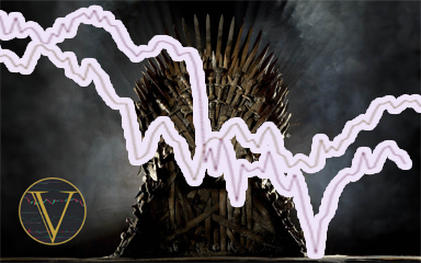
Game of Fractals
Fractals in Price Action can be dangerous things.
On their own they lack context and in trading context is generally key to decision making when we’re attempting to play probabilities looking for an edge. While it’s absolutely true that there are patterns that repeat on all timeframes, including the Macro, we need to consider the larger context around these repeating phenomena rather than just look for fractals in price that look similar. This is what led me to the idea for this article.
Time and Price
Ok, so lets get this out of the way, I am a fan of ICT concepts. Despite what anyone may think of Michael himself (I actually like his approach) I have taken the time to learn, test and work with his concepts and in my view having done that there’s no question to me that he’s come up with some outstanding, applicable theory. It’s not the only thing I use by any means, but I appreciate it all the same.
One of the foundations of his process involves using Time as a key pair to Price. From an Intraday level using sessions (or Kill Zones) or from a Macro perspective using Seasonality to aid in probability, Time is a key component in working with Price, from a trade probability perspective.

I am also a fan of Bob Loukas, who does some outstanding work on cycles and cycle analysis, another application of Time working alongside Price to aid in decision making and probability analysis. Bob has a very different approach to ICT, though there are some similarities in their 60 day cycles and lookback/caste forward, but the main point here is that both leverage the Time component as a key element of their analysis.
This has been something I have been testing, from Intraday and m1 charts all the way up to M12 charts and yearly macro analysis across asset classes. I have found the results of that testing truly fascinating, to the point that they are starting to shape my thinking on all timeframes. And thus, we get to the crux of this article: The dreaded 2008 Fractal!

The 2008 SPX Fractal
The 2008 SPX fractal has become increasingly prevalent on Social Media (mine at least) over the last few months as people look for a potential roadmap for where markets may be headed as we reach the end of 2022.
The image to the left (click to enlarge) shows the current SPX chart, with the fractal in question added, no resizing or tweaking, just copy and place at the high.
I can absolutely see why this has become interesting to people, the fractal, from the top at least, is compelling in terms of how Price has moved. But, I have some real issues with this as a theory and, if you’ve been paying attention you may have an inkling as to why. Time!
The Fractal that Time forgot!
In a previous article I covered my thoughts on the Bitcoin 4 Year Cycle and whether that may, or may not, be a coincidental correlation with the Halving or simply that it slipped right into the normal SPX 4 year cycle around the US Presidential Term, as a correlated asset (BTC and SPX).
Granted that article was focussed on BTC and the legitimacy of the Halving from a planning perspective, but for the keen reader there were a few other conclusions that may have been drawn from that piece, one of those, the SPX 4 year cycle, being the focus of our investigation here.
So, as we covered above, the 2008 fractal is compelling. It comes from a time when Financial Markets entered turmoil, an outcome many fear and many more are predicting is in our future. The Price levels line up fairly well and it’s impossible to argue that macro economic factors linked to the War in Ukraine, rising inflation/cost of living across the World and another potential housing bubble to name a few don’t paint a worrying picture.

And this is before we acknowledge that most of us would question the ability of our current worldwide incumbents of financial decision making power to run a tuck shop.
Nonetheless, I still have an issue with the 2008 Fractal and its use here. Again, I understand, as above, all the reasons why it has become popular, but I would make the case that we, as humans, are rather prone to bouts of recency bias, which is why this fractal was at the forefront of peoples minds in the first place. 2008 was only 14 years ago and most of us lived through it. As a parallel, it fits with that bias:
Recency bias is a cognitive bias that favours recent events over historic ones; a memory bias. Recency bias gives “greater importance to the most recent event”, such as the final lawyer’s closing argument a jury hears before being dismissed to deliberate.
But if we look at the data, going back to 1928 (nearly 100 years), it doesn’t fit with Time.
The 4 Year SPX cycle, 2008 and why it is an odd fit
So, we return again to my fascination with the SPX’s 4 Year Presidential Cycle. As I covered in my last article around Bitcoin Halvings, the SPX has been running in a fairly consistent 4 year cycle around the Presidential Cycle for as far back as I have been able to gather data.
The image to the right (click to enlarge) shows the general makeup of this cycle. Up in Year 1, down in Year 2, up into Year 3 with consolidation before continuation and consolidation again into Year 4.
Broadly speaking, this has been the case.
So let’s cut straight to the chase. 2008 was Year 4 of the Presidential Cycle (2004-2008) and we are currently, in 2022, in Year 2, the Mid-Term year. From a cycle perspective, Time doesn’t match up. Further, within the context of the cycle, the tops don’t match up in time either. The top that preceded the crash was in October 2007, whereas in 2022 the Top was in January 2022 (right where the Year 2 cycle top should have been).

So, to confirm, we have the wrong year of the cycle going back ~100 years with all the data we have AND the months are out by a full quarter as well.

Raw Data | Mid Term Year
So 2008 doesn’t appear to fit with Time from a cycle perspective and has to be jimmied a little to fit with time (+3 months) from a fractal perspective. Is there anything else within the 4 year cycle that is interesting to us, data wise.
Well, yes, indeed (or at least to me!).
- Firstly, it is of interest that the opening 3 quarters of the midterm year are more often than not erratic, flat or down (a lot!), but that Q4 sees the bottom alongside the Mid-Terms themselves before a positive return through H1 in year 3. Even the years with large drawdown in Q1-3 recover.
- Secondly, only twice in 23 instances has Q4-H1 return not been positive, the last of these coming in 1938 (the only other in 1930). That’s 91% of the time, over 23 instances and nearly 100 years of this cycle this period has been positive
- Thirdly, not since 1946 have we had a negative H1 in Year 3 and this has only happened 3 times in 23
- Finally, is there a cycle within the cycle? The 20 year (or 5 cycle) run? Highlighted are all the years ending in 2 and 2 of those have had similar Q1-3 as we have seen this year. Might be interesting to dig into those fractals, given they are at least correct in Time, from a cycle perspective, no?
Now, before we move on it would be pertinent to mention that this cycle phenomena is also prevalent in the Dow and that the aggregated Q1-3 and Q4 return for both in Year 2 support this data. I will link these at the end of the article as appendixes.
The 20 Year Fractals
So, lets just go the whole way and look at the 20 year Fractals we have the data for, 1962, 1982 and 2002. 1942 unfortunately is not available on Trading View.
Well, that’s interesting. The two years where Q1 to Q3 has been most similar thus far (1962 and 2002), starting from January, have been very, very similar to what we’ve seen to date in 2022. Same year in the cycle so fits with that Time perspective, starting at the same month so fits with that one too. Interesting.
1982 started off very similar, but posted a higher low before moving higher. In general though, you can see the similarities in terms of movement, the overall aggregated fractal playing out as noted in the appendixes.
How does it look if we add the 2008 Fractal, but only start from January 2008, not October 2007? Some similarities, sure, but still not as many as 1962 or 2002.
Finally, what if we add demarcation of the 4 year cycle, just for completeness?
Again we can see that the overall pattern of Year 1 and 2 have been where they should be thus far with the aggregated pattern for the decennial (as shown in the first image at the top of this article) bouncing almost exactly where one may expect it looking back at that data (the blue line).
And what’s even more interesting is that, no matter how you cut that data set, from presidential first term to decennial, to all cycles aggregated, there’s always a second bottom that takes out liquidity below the first moving into Q4. That, it would appear, is happening now.
In Summary
So, to summarise the main points here:
- There is a (IMO anyway) clear 4 Year cycle in US Indices that goes back at least 94 years that we have data for
- That cycle has gone through 2 world wars, every high to low rate period in that time, Inflation, Recession, health emergencies (prior to Covid), unrest, energy shortages, job shortages, multiple political and social movements and anything else you can think of that might be happening right now
- It has remained consistent throughout
- The 2008 Fractal, compared to 2022 is comparing Year 4 to Year 2: Apples to Pears from a Time perspective
- The data we have for Mid-Term years is hugely consistent over time and ties in with what we have seen so far in 2022
- The overall aggregated fractal for Year 1 into Year 2 of all cycles, decennial cycles and 1st term cycles lines up well with what we have seen so far in 2022
- Of the decennial cycles, 2002 and 1962 fit much better with Price from a Price AND Time perspective than 2008, without the need to jimmy the data
Conclusion
I am not predicting that everything is about to turn to unicorns and rainbows, there are always variables at play that can impact things outside of a historical chart, though in my defence that would apply to the 2008 fractal as well as the alternates I have proposed.


But what I am saying, at least for my own planning, is that I am open to the possibility that near 100 years of consistent data shouldn’t be ignored in favour of our recency or confirmation biases. We deal in probability and in this data we have a suggestion as to what that may well be. So I am looking for the current SPX low to be taken into Q4 and then for signs of a change in market structure heading into H1 next year.
With the gloom around, the 2008 fractal projections and fear about global financial collapse, this is what buy the fear of others surely feels like, as much as our heads are telling us buys here are risky.
Am I open to this not playing out? Of course, I don’t need to be right I just need to have a plan. And I would rather have a plan based on data and not need it, than be “sure” of an outcome based on an out of time Fractal and be the one left holding the bags.
Appendixes


One thought on “Game of Fractals”
Comments are closed.
Based.